When do data visualizations persuade? The impact of prior attitudes on learning about correlations from scatterplot visualizations
When do data visualizations persuade? The impact of prior attitudes on learning about correlations from scatterplot visualizations
Abstract
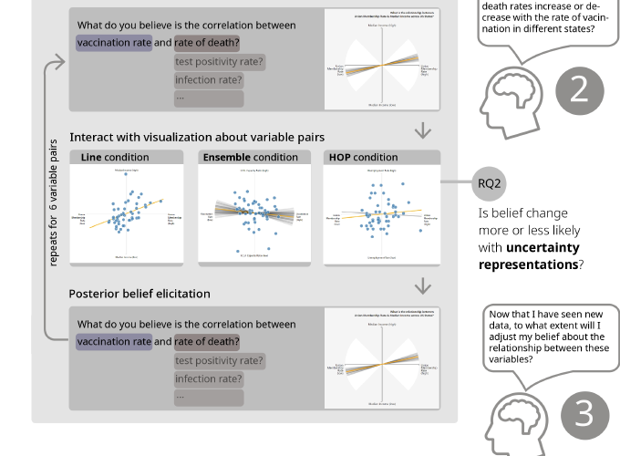
Data visualizations are vital to scientific communication on critical issues such as public health, climate change, and socioeconomic policy. They are often designed not just to inform, but to persuade people to make consequential decisions (e.g., to get vaccinated). Are such visualizations persuasive, especially when audiences have beliefs and attitudes that the data contradict? In this paper we examine the impact of existing attitudes (e.g., positive or negative attitudes toward COVID-19 vaccination) on changes in beliefs about statistical correlations when viewing scatterplot visualizations with different representations of statistical uncertainty. We find that strong prior attitudes are associated with smaller belief changes when presented with data that contradicts existing views, and that visual uncertainty representations may amplify this effect. Finally, even when participants’ beliefs about correlations shifted their attitudes remained unchanged, highlighting the need for further research on whether data visualizations can drive longer-term changes in views and behavior.